Arch: Diversified Decentralized Finance Investing

Founding Product Designer

2021-2023

arch.finance

Overview

Redesigning a Core Conversion Flow for a DeFi Investing Platform

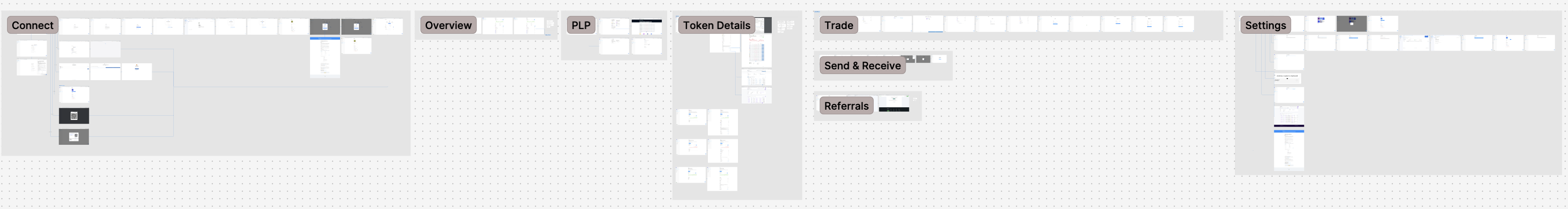
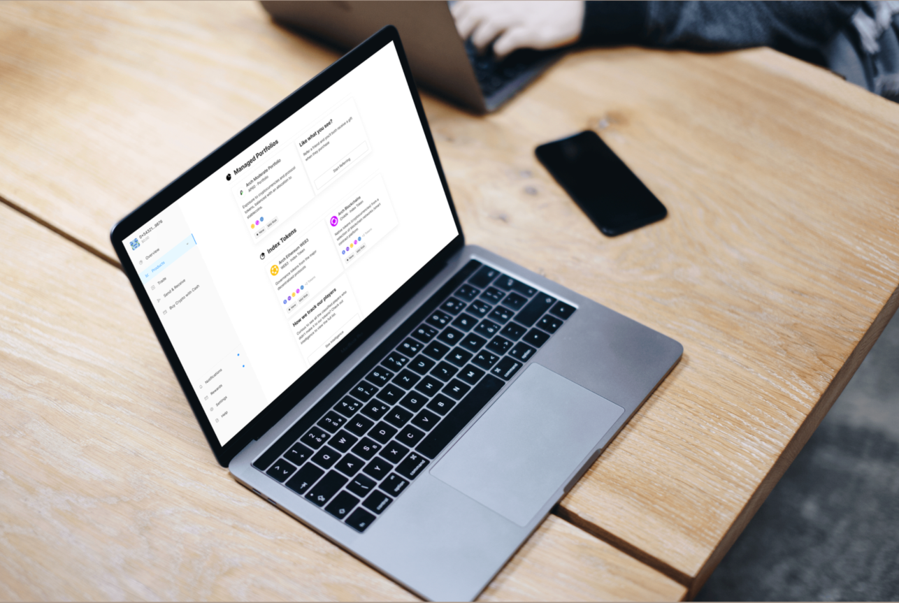
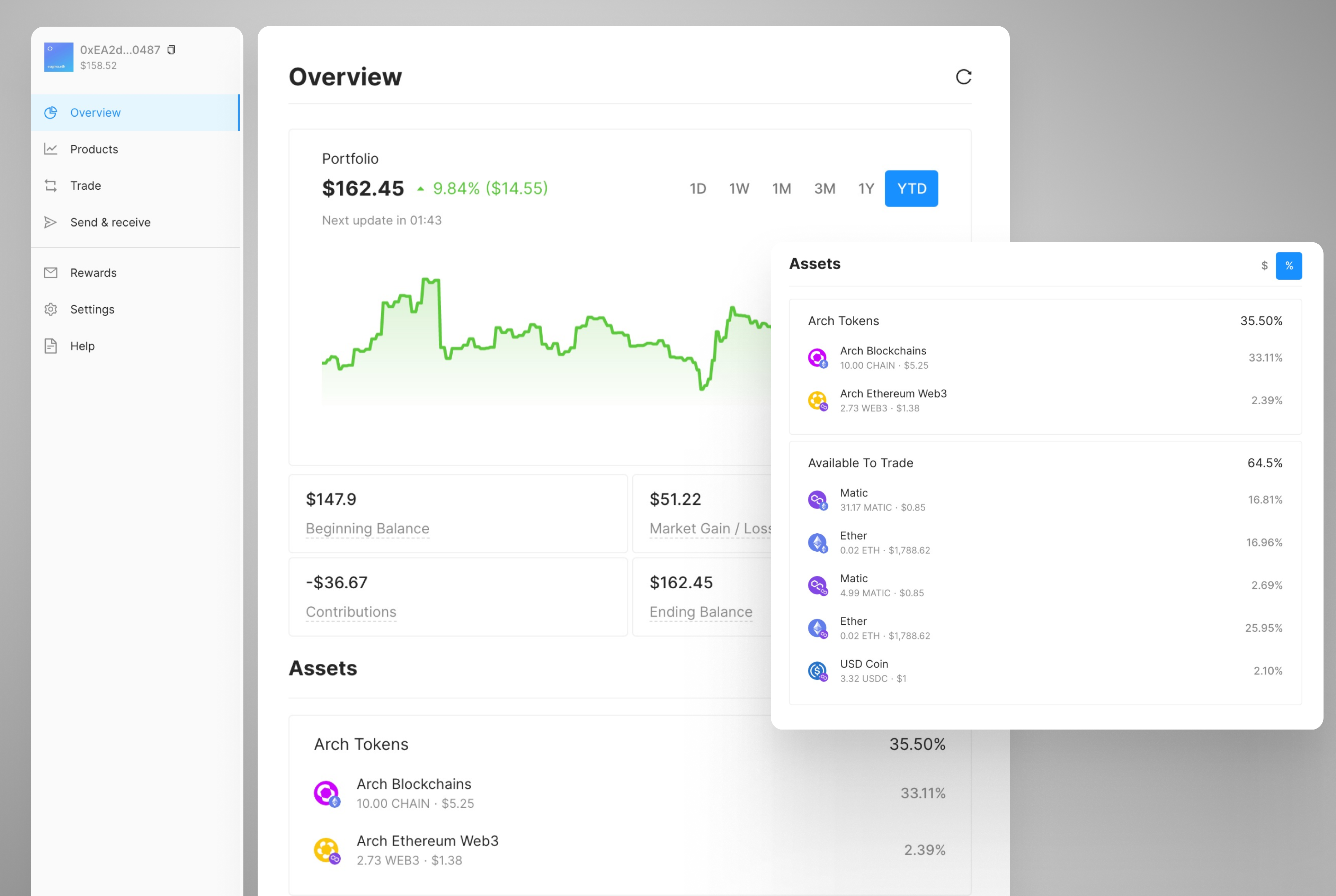
I led the end-to-end redesign of Arch's onboarding and investment flow after the initial product launch resulted in less than 1% user conversion. Through user research, funnel analysis, and UX restructuring, I reduced cognitive load for new users navigating complex DeFi transactions for the first time, increasing conversion to 18%.

Read case study for our first experience that failed

Role

Founding Product Designer

Team

CEO, CTO, CPO, engineers

Timeline

10 weeks

Platform

Web & Mobile

Responsibilities

As Founding Product Designer, I owned UX strategy, product flows, interaction design, and design system creation, working in close collaboration with engineering and founders.

The Problem

Although Arch offered a compelling DeFi investment product, the onboarding experience created significant friction for new users. Less than 1% of users completed the core investment flow.

The product's value proposition was unclear, the experience didn't align with familiar financial UX patterns, and Web3 concepts like wallet connections introduced unfamiliar steps too early in the journey. As a result, users dropped off before reaching the core investment experience.

Research & Insights

Users approached DeFi investing with mental models shaped by traditional finance. However, the product introduced unfamiliar Web3 interactions before establishing trust or familiarity.

To understand where users struggled, I analyzed product funnel data in Amplitude, existing product metadata, and usability patterns across established fintech platforms. I also conducted multiple user interviews to understand how new users interpreted the product and where confusion occurred.

Research session including competitive benchmarking, flow analysis, insights, insights synthesis, flow proposal, and storyboard

Design Approach

Rather than exposing the full complexity of DeFi upfront, the redesigned experience was restructured to guide users using a new mixture of familiar UX mental models of traditional finance and e-commerce.

Key changes included: 

  • Creating a product listings page
  • Aligning interaction patterns with familiar UX mental models like introducing wallet creation as creating an account
  • Funding wallet directly with fiat became possible after implementing our own onramp
  • Simplifying decision points in the investment journey (fewer clicks to purchase)

Mobile app UI/UX design using new design system library

Desktop app UI/UX design of wallet and product overview page

Outcome

The redesigned onboarding flow increased conversion from <1% to 18%. Users could complete complex DeFi transactions with greater confidence, and the redesigned UX became the foundation for the product going forward.

Creating or connecting a new Web3 wallet and making a purchase screen

Overview of launched end-to-end experience that achieved 18% conversion rate

Reflection

Arch was the hardest kind of design problem because the product was asking users to trust something they didn't fully understand yet. No amount of visual polish fixes a broken mental model, and that was the core lesson of this project.

The biggest thing I'd do differently is push harder on progressive disclosure from the very beginning. We simplified the flow, but some Web3 concepts like wallet creation and on-ramp funding were still introduced before users had enough context to understand why they needed them. Earlier, more structured concept testing would have caught that sooner.

This project also shaped how I think about onboarding as a design problem in general. Onboarding isn't just orientation. It's the moment where a product either earns trust or loses it. Getting that right requires as much strategic thinking as it does interaction design.

Arch product details page mock-up